


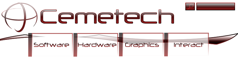
To tell you the honest truth, I'm really not totally crazy about Cemetech v5. With that in mind, I've been messing around with some ideas, and I actually got a few that could make a radical difference in the site. Anyway, here's a random header I have drawn up; what does everyone think?


: TI Runner-Up")


I like the logo, that is awesome. Search box looks great as well. Buttons... That isn't so great... :/ It just doesn't seem to match the logo.

too big - way too big. Its a header, not the site itself. It should be more or less out of the way - thats one of the things I don't like about V5. The buttons at the top are ridiculously huge - cmon man, we aren't blind here
This is doubly true if you are going to have the buttons under the logo again. Oh, and can we get some color going on? The red on white is a little blad and boring, and your new one is mostly just white. I paid good money for this 24-bit color screen, at least use more than 256 colors
This is doubly true if you are going to have the buttons under the logo again. Oh, and can we get some color going on? The red on white is a little blad and boring, and your new one is mostly just white. I paid good money for this 24-bit color screen, at least use more than 256 colors


rivereye wrote:
besides the fact that they are all huge, I prefer the second one.
I made them huge so you could see detail. Cool deal, second one it is; I felt the same way myself. That was a color scheme question, btw, not a graphics question. Underhanded, eh? 
I like the 3rd one, although none are really all that great. Why in the world is there a solid stripe at the top of the second one? If anything, a shadow would logically be at the bottom, but the stripe is just harsh looking, ruining the smooth flow of the gradient that covers the rest of the button


I say 3rd, if you go with 2nd make it somewhat symmetrical on top and bottom, the line at the top kinda looks... well... wierd...
Any fool can use a computer. Many do.


Kllrnohj wrote:
I like the 3<sup>rd</sup> one, although none are really all that great. Why in the world is there a solid stripe at the top of the second one? If anything, a shadow would logically be at the bottom, but the stripe is just harsh looking, ruining the smooth flow of the gradient that covers the rest of the button
Seconded.
Duly noted. Just trying to be original with button design there. 
the_m0053 wrote:
Is the "Interact" button supposed to be a cool word for forum? If it is, I like forum better.
No, it's going to cover deveral things including the forum, hence Interact. KermMartian wrote:
Duly noted. Just trying to be original with button design there.
the_m0053 wrote:
Is the "Interact" button supposed to be a cool word for forum? If it is, I like forum better.
No, it's going to cover deveral things including the forum, hence Interact.perhaps Discuss would be better.
Yeah, but it's gonna have the Forum, Links, and probably About as well.
Edit: Submitted for your perusal and approval:
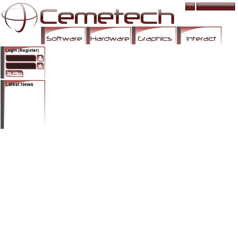
Edit: Submitted for your perusal and approval:


still too large of a header. That is going to take up a bit of real estate, not to mention is rather bland. Its a whole lot of white, whooopdedoo
Register to Join the Conversation
You cannot post new topics in this forum
You cannot reply to topics in this forum
You cannot edit your posts in this forum
You cannot delete your posts in this forum
You cannot vote in polls in this forum
You cannot reply to topics in this forum
You cannot edit your posts in this forum
You cannot delete your posts in this forum
You cannot vote in polls in this forum
Advertisement