EDIT: I wrote this post a while ago and forgot to submit it. I guess I'm a bit late on some of my points? XD

I get frustrated when I'm away from a PC and am unable to view the content PCs are able to. A mobile browser should allow the user to view what (s)he was visiting the site for, which could include any content you have on the site. You don't want to exclude the mobile user from information.

It should just be a compact version of the original website. The information should be organized slightly different, of course, to make it compact and readable.

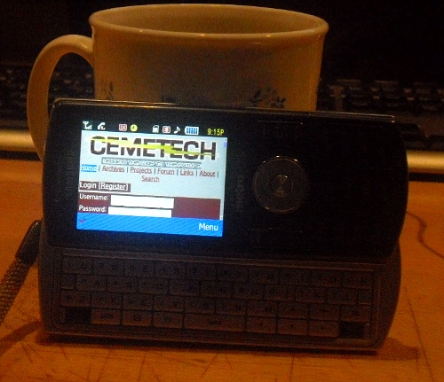
The screenshot you posted is a bit cluttered. Most of the time you want a mobile website to have only one column with (for smartphones) an expandable menu of options.

The font also needs to be a good medium size. I could see this design being too small for a smartphone. You can't have small text sizes, otherwise people will need to zoom. People don't like to zoom unless they have to, or unless they're interested in looking at a specific detail. Some sites disable zoom, however, and that's a bad idea too. But you don't want users to have to zoom to read, otherwise there is practically no reason for a mobile version except to lower data-transfer (for yourself mainly, seeing as most (not all) users have unlimited data plans). If that's the case you might as well turn your whole site into a compact form if you're worried about bandwidth Razz

So, you want (a) medium, readable font, (b) [typically] one column, (c) the same content, but organized for mobile.

What resolution is that screeny taken at?
I have a Stylus so ease of navigation really isn't an issue for me, but yeah on the iDevices I could see that being an issue.

Also comic that fails so much in PIE, its either the CSS or just the fact that your layout hates QVGA but on my phone the red boarder is the whole text area. Once I get synce fixed I can post a screenshot. Though if you get it to look like that screenshot I'd say that its much better than Kerm's so far. Razz

Edit: Opera 10 mobile rendered it more like the screen shot, but it like to fudge things and it rendered it more like a desktop page you would zoom on rather than as if it were a mobile page.
comic, I like the one-column, but like I mentioned, I think the font-size should be larger.

I, personally, don't enjoy zooming much at all. It's quite a pain to have to zoom, but I will if I have to. I would much rather just scroll. A larger font-size to make it a bit more legible is what I would suggest. I think most would have a very, very difficult time reading without zooming. What does everyone else think?

Also, I like the size of the logo and slogan in that example, comic.


TheStorm wrote:
Edit: Opera 10 mobile rendered it more like the screen shot, but it like to fudge things and it rendered it more like a desktop page you would zoom on rather than as if it were a mobile page.
That's what they were going for Razz
Swivel: I was able to read the smaller font quite easily, though I have a rather high dpi screen and the smaller font was easy to see. I'll start viewing the site on my iPod as well to simulate lower ppi devices. I don't have any other mobile devices to test with. Maybe, just maybe, I can load web pages onto my old Windows Phone and view them, but ever since I broke the antenna, it's been useless. Also, no wifi to begin with... so. But I'll try and load it on there for the smaller screen size.

Increased the default text size to 1.5em. Doing that seemed to alter the sizes of the other text as well (tried to compensate, CEMETECH is now 3.5em rather than 5em), I'll have to track that down!


Also, screen is 960-by-640-pixel resolution at 326 ppi.


TheStorm: Anyways, I'm not surprised. Since I tell all div tags to single background color (maroon) unless specified. PIE must not recognize !important values after properties. I'll likely end up changing it the other way - no background value unless specified - because I have more boxes with 'background-color:#ccc!important' than I have divs with backgrounds (believe it or not).

The part of the code in question comes from color.css
Code:
div#parent div {
    background-color:#7b291b;
}

div.content {
    background-color:#ccc!important;
}

div.news, .title, .author, .post {
    background-color:inherit!important;
}


BEFORE & AFTER

Larger font still?
TheStorm wrote:
IMO if you must use sizes use pt, but even then you don't really have a clue as to what the DPI of the screen is and whether it is configured properly.
Well, em sizes are scaled to the browsers default, so 1.0em is the browser's default size, 2.0em is twice as wide and tall, 0.5em is half width and height, 0.9em is just a bit smaller, etc.
KermMartian wrote:
TheStorm wrote:
IMO if you must use sizes use pt, but even then you don't really have a clue as to what the DPI of the screen is and whether it is configured properly.
Well, em sizes are scaled to the browsers default, so 1.0em is the browser's default size, 2.0em is twice as wide and tall, 0.5em is half width and height, 0.9em is just a bit smaller, etc.
Ahh I had forgotten that, thanks, I'd use that method then. I'd keep the main content text at the browsers default and then go from there. Also keep in mind that PIE on older WinMo devices is based on the IE5 rendering engine, so if it doesn't look right in IE6 then it for sure won't work in PIE for users of WinMo 6.1 and lower.
Minor updates.
  • Added 10px padding to the right of the news body to match the 10px padding on the left
  • Commented the HTML a bit
  • Updated the "close before this" text to be more visually alerting and informative


Check it Out
Some comments:
1) Are you setting Px sizes rather than Em sizes? It looks huge on Firefox on my desktop, which I wouldn't expect.
2) I'm really not loving the gold-texted logo. Any possibility for an image for that, for the sake of branding? Even Google and Twitter use their image logo on their mobile sites.
3) Font face: Please oh please something sans serif.
I was under the impression the text was just a placeholder for the mobile logo and slogan Kerm was using in his example?

Also, text size is good, but of course I haz 20-20 vision. Anyone else view it on a mobile device and have trouble reading the content without scrolling?

Horizontal view is a great size.
I haven't tried looking at it on a mobile device, let me do so now. And I got the impression that he was omitting the images entirely...

The verdict: The font is HUGE on my phone, "Published by KermMartian on" takes up the width of the screen in horizontal mode, and "After a long summer of" takes up the width in vertical mode. Obviously you optimized the font size for Apple devices.
Definitely. What mobile phone did you test it on, Kerm?
Swivel, I tested on my Samsung Messager II (r560) [the screenie below is from my own c6m demo]:

Kerm, that looks pretty good on that Samsung. Do you have a live link to your example that we can visit on our other devices? Smile
swivelgames wrote:
Kerm, that looks pretty good on that Samsung. Do you have a live link to your example that we can visit on our other devices? Smile
If you are able to set your user-agent to anything with MMP/2.0 or WAP/2.0 in it, and visit the normal Cemetech site, you'll see it.
The only px I use is for padding and margin, font sizes are purely in em. It should be big in firefox, any screens of it on other phones please?
comicIDIOT wrote:
The only px I use is for padding and margin, font sizes are purely in em. It should be big in firefox, any screens of it on other phones please?
I'll take a picture of it on mine. Trust me when I say that it's pretty terrible though. Are you using 1.0em or giant, 3.0em-type-things?
3.0 em things. I don't think percent would be any better.

Regarding designed for iPhones, I can't test on anything else but just about every phone these days has a larger screen than your phone Very Happy
comicIDIOT wrote:
3.0 em things. I don't think percent would be any better.

Regarding designed for iPhones, I can't test on anything else but just about every phone these days has a larger screen than your phone Very Happy
But what's wrong with just using the default font size? Does mobile Safari do something ridiculous like make the default font size unreadably-small? Sad
It's a virtual screen size of like 1024 by 800 I think. I'll see what I can do to verify.

1091 by 980 is the browser size on my phone.
Well if it is on an iPhone, the landscape view is bigger without having to zoom in. If the text size is readable in landscape, then that should be enough, just the formating, unless I am going over something extremely obvious...
  
Page 2 of 21
» All times are UTC - 5 Hours
 
You cannot post new topics in this forum
You cannot reply to topics in this forum
You cannot edit your posts in this forum
You cannot delete your posts in this forum
You cannot vote in polls in this forum


Advertisement