This thread will be for comicIDIOT, Merth, and myself to discuss Cemetech6mobile, a mobile version of the popular Cemetech theme. I'll start off with the current live C6m theme, showing more or less what I have in mind (I shrank my browser and text size to simulate a mobile device

).

For this screenie, I created a new overall_header, new overall_footer, new stylesheet, logo and motto images, and home_index and news_item.
Status of Pages
Finished:
- Site Index
- Search: Query, Topic Results.
- Forum Index
- Topic
- Post/New Topic
- Profile Pages
In Progress
- Categories
Needs to be Created
- Private Messages
- Search: Post Results
- News Archive
- About
- Links
- Projects
I'm not overly impressed. Not everyone has an unlimited data plan *coughcough* so saving on data is a key factor. I believe that's more so on Mobile Devices, unlimited data or not.
It would help making new templates for everything easier, but I don't think it's the best option we can come up with. I'm not saying
my style is the best.
A consolidated list of browser sizes that people will & may view cemetech on. If you'd like to get your device added here, please reply with your device name (I.E. Blackberry Curve 8500) with a
browser size of X by Y. You can
find your browser size here.
Browser Size List
:: iPhone 4 Mobile Safari - 980x1091
:: Opera Mini for iPhone - 320x384
:: PS3 on 1080HD - 928x1094, 648x766
:: PSP - 480x272
:: Symbian(OS?) - 240x320
:: "PIE" (Phone?) - 1000x2175
comicIDIOT wrote:
I'm not overly impressed. Not everyone has an unlimited data plan *coughcough* so saving on data is a key factor. I believe that's more so on Mobile Devices, unlimited data or not.
It would help making new templates for everything easier, but I don't think it's the best option we can come up with. I'm not saying
my style is the best.

Edit: Oh, and just to be clear what my thoughts behind that were, I am in favor of something that'll evoke the full-sized Cemetech template, just lighter-weight and smaller.
I think something streamlined. A user visiting the site on a phone wants to see basic info. Maybe that includes the projects & archives. I for one, only need the Index, Forum & Search.
But something that can load fast. It'd be great to view a clean, simple cemetech on a mobile device instead of a watered down style that includes the same aspects of the real website, minus images.
I'm guessing that theme there won't view well on your phone. When I think mobile, I think quick. You shouldn't need to zoom around to get the info you require, it should be presented readably & readily on the screen. Though, with forums that's not always the best case, with not being able to zoom. Because then a post will take up several screens. This post will likely take three or more.
Most importantly, the navigation should be large enough to press with fingers (for touch displays). There's a lot of things that should be considered aside from stripping images and simplifying style a bit. In most cases websites are entirely re-templated.
Those are all fair points, and I'd love to see how it works out on my phone, which is on the browser-wise more limited end of the spectrum. I'm working on a cheap user-agent hack just to see how it looks; I'll post a photo if I can manage one. Can you show me some back-of-the-envelope sketches of some alternatives that appeal to you? As you mention, one thing I'm concerned about is making pages of posts short enough to fit on phones.
Okay. I took you up literally on it.

I think keeping to a one-column layout is the only option. Here, we have From box to box:
1. Logo Text
2. Navigation
3. Welcome Back, Login, Logout, PM's
4. Content
Still brainstorming the posts. I've come up with one, two line summaries and an option to click more, which will load the post in it's entirety, but it'd be cumbersome to read an entire thread one post at a time.
I don't hate the one-column layout. Something to keep in mind when designing the templates, though: they can't vary horribly much, contentwise, from what's in Cemetech6. It's easy to leave out fields and such, but not so easy to add new fields or to truncate existing fields.
PS - I laughed aloud at your back-of-the-envelope sketch. You win at least an internet or two for that one.

I'm not taking much out. The "New Posts" can land inside Content since it resides in the same location as the introduction and news. The forum would fit in there. To save space on smaller screens, the news can show up as titles only.
The forum is going to be the hardest bit. I say we scour the web for how other forums mobilized themselves there.
That's fair. The forum index would be a simple table, the viewforum pages could be simple tables too; I suggest we just disallow a lot of things like editing your profile, getting to the admin control panel and moderator control panel, etc. Here's how the current C6m looks from my phone; it doesn't seem too happy about the nested tables, or else I made a mistake in my markup:
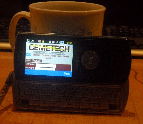
This is what I see

But seeing what real-estate you have work with is... ouch.
Ooooh, that actually looks really nice to me! I'm sure the bandwidth is a problem though, as you mentioned.
A one column layout is a must, and sax should be popout only IMO. Also how are you guys testing these from your phones, I can doa test with my QVGA phone to really give the layout a workout, as QVGA is just about the worst case senerio for this kinda of thing, if it works there it'll look good anywhere.
TheStorm: Tell me what the user-agent string is for your phone's browser, and I can add it to the C6mobile-force list. Sax will indeed be a popup, if it's even included at all in the mobile version. Do you have any other suggestions between one column?
KermMartian wrote:
I'm sure the bandwidth is a problem though, as you mentioned.
Surpsingly, I use about 1GB a month out of my 2GB's, so it's not a major issue, but loading images over 3G is something I like to avoid.
I can't think of anything else to add. SAX should be a browser only, not a mobile feature. It works fine on my phone. Maybe a popup isn't a bad idea, but have the user join the room when they open SAX.
I'll mock out what I think CM6 should look like.
Awesome, can't wait. Do you think it would be possible to stay within the maroon/gray/black/white values that I have? Or will that constrain the design too much?
Won't hurt at all. I plan to make it identical. I'll be replacing the mock on my website by Tuesday or so
I have work Tomorrow-Monday so, updates then but mostly offline.
Yeah, get rid of that left column, it makes the page waist sooooo much space, and without sax its rather dumb to have IMO.
Also, try to remove and CSS specifying text size, let the borwser handle that, headers are fine, but setting font sizes yourself will just make things break.
TheStorm wrote:
Yeah, get rid of that left column, it makes the page waist sooooo much space, and without sax its rather dumb to have IMO.
Also, try to remove and CSS specifying text size, let the borwser handle that, headers are fine, but setting font sizes yourself will just make things break.
*Waste?  What about if I/we/comic use em sizes instead of px sizes? That will let the phone browser choose the basis for the scaling.
IMO if you must use sizes use pt, but even then you don't really have a clue as to what the DPI of the screen is and whether it is configured properly.
KermMartian wrote:
What about if I/we/comic use em sizes instead of px sizes?
THAT'S EXACTLY WHAT I DID. lawl.
Anyways, updated C6M on my domain.
What it looks like from my phone.

Does anyone want to vote that the current Cemetech, It's motto and the navigation are a bit large? I made them large so they can be seen and so the nav can be used easily on touch devices. Any opinions there? Should I decrease the size a bit?
Added c6m as a subdomain for those who have tried to access it from there. CM6 comes more naturally to me, so that's how it was at first. Now, the same style can be seen from http://cm6.comicidiot.com & http://c6m.comicidiot.com